Subscribe to stay on top of our latest content!
Share this article
If your sales process involves collecting fact-find type information from leads by asking them to complete a form, you'll want to do everything you can to ensure as many leads as possible complete and submit the form successfully. But what can you do optimise your fact-find forms in order to boost your form completion rate?
Whether it’s an income and expenditure assessment or a form to gather details about an upcoming house move, whatever the focus, our Journeys fact-find tool is packed with features that make it easy for you to increase your form completion rate.
Here’s how you can use Journeys to effortlessly boost your form completion rate:

Written by Lauren Shaw
10/03/2020
1. Allow leads to complete forms themselves
With customer-facing forms, you can collect information from leads by allowing them to complete your form independently at a time and place that’s suits them. It’ll save your staff time, it’s more convenient for leads, and it’ll help you get important details right first time and increase your form completion rate.
The form can be displayed through an iFrame in your website, or as a standalone page reached via a redirect within your website flow or by sending your lead a link via email.
Showing the form as an iFrame means you can wrap it in your brand and up-sell information, whereas a standalone page is mobile and tablet friendly so your leads really can complete it at a time and place most convenient to them.
2. Keep forms short by using conditions
If you show your leads too many questions at once, or ask them questions that aren’t relevant to them, they might feel overwhelmed and give up on completing your form. That’s why it’s important to keep them short.
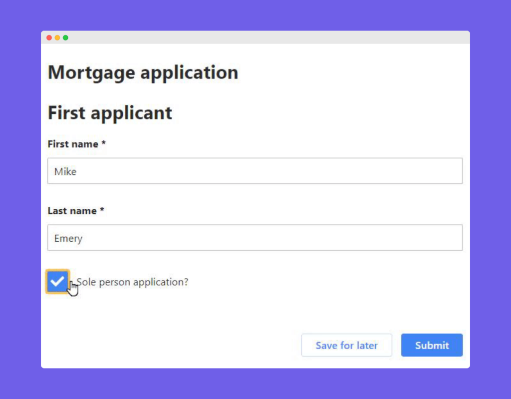
Journeys allows you to add conditions that show or hide fields in your forms based on the response gathered in a previous field. That way, you can personalise the route a lead takes to complete a journey by only asking them relevant questions. For example if it’s a sole applicant, there’s no need to display fields for a second applicant.
Plus, conditions can help to reduce the length of the form when it loads, visually giving your leads the impression that it won’t take too long to complete, which some of our customers tell us is key to their form completion rate!
3. Use an intuitive, user-friendly form style
When your forms are in the hands of your leads to complete at their leisure, you need to ensure they’re as accessible and easy to complete as possible.
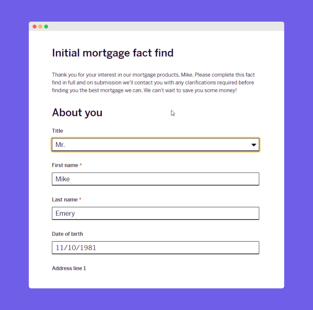
We’ve spent a lot of time perfecting the style of our forms, so all you have to do is design the content and you’re away!
Some of our optimised styling modifications include the way we highlight field focus and errors, use effective fonts and colours, display prominent buttons, and show confirmation of a successful form completion rate.
4. Add helper text to form fields ℹ️
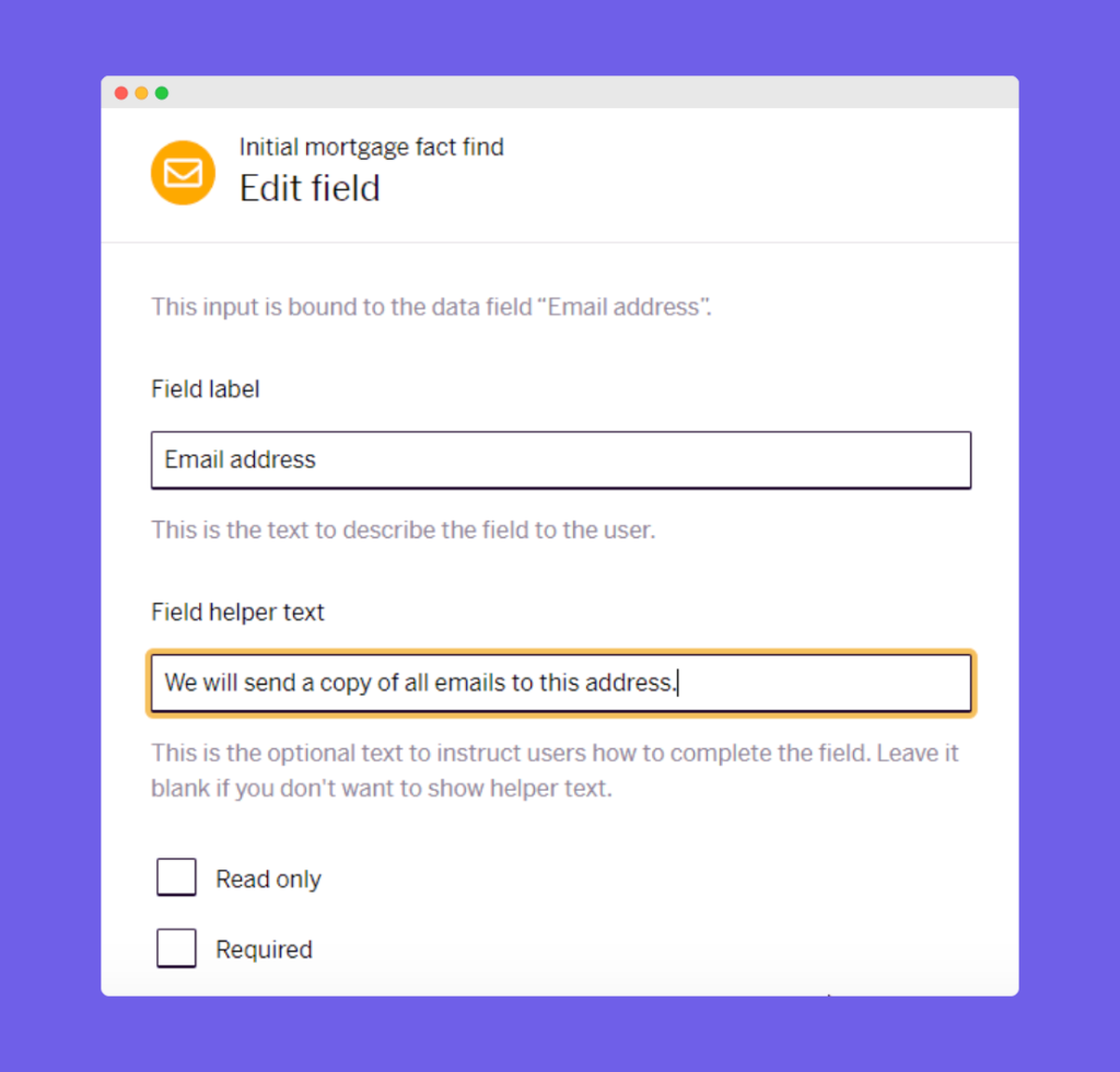
Wherever you feel your leads might need some guidance or clarification when completing your form, instruct them how to complete a field in your own market-specific language or brand style by adding field helper text.
This text can be shown neatly above each field in your form, so there’s no need for long label names to try and explain how to complete it!
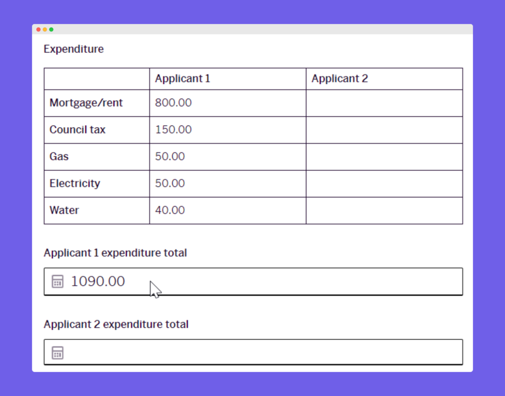
5. Handle calculations on your lead’s behalf
Need a total figure from your lead? Don’t make them reach for a calculator and risk putting them off. Our in-page calculations can add meaning to the data collected in all integer, decimal and currency fields – perfect or income and expenditure summaries!
6. Display important information and get instant acknowledgement ✅
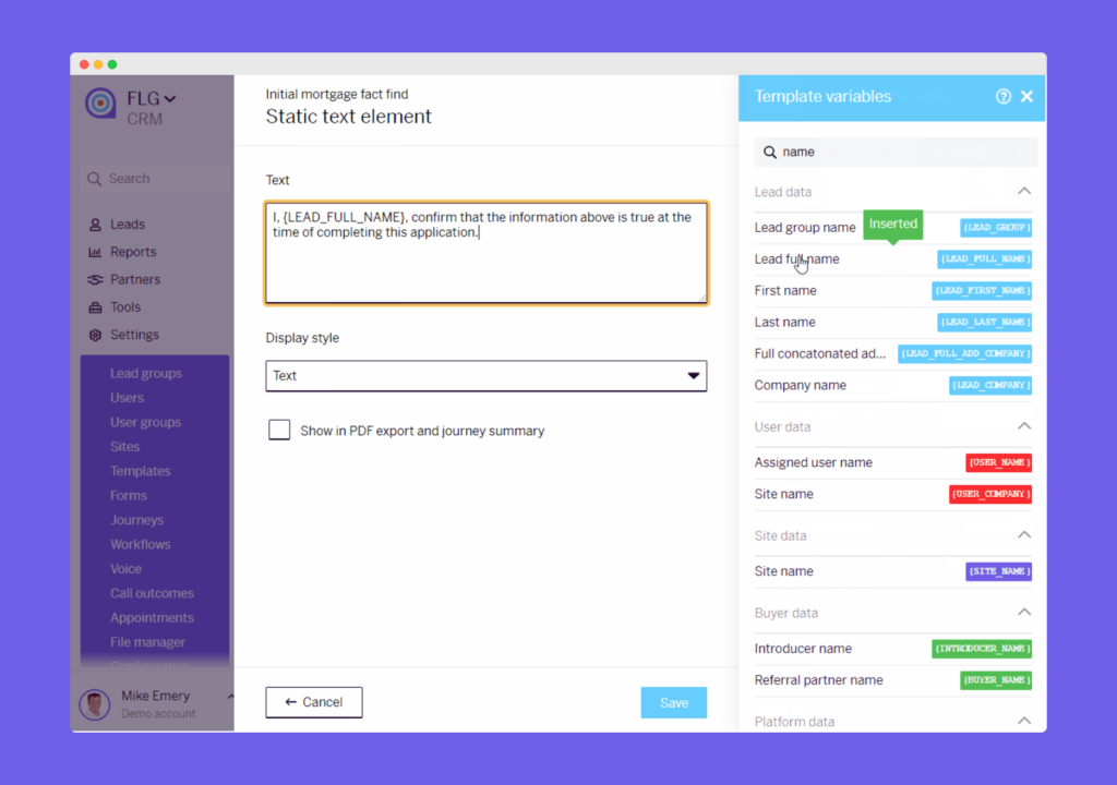
If you’ve got important information or terms and conditions that you need to make explicitly clear at your fact-find stage, using static text within your form to display your message eliminates the need to send separate communications and await acknowledgement.
You can even use template variables to add dynamic values to your static message. For instance, you could add your lead’s name within a statement covering the terms of your service and require them to tick a box to confirm they agree to them. This provides complete transparency and will make them feel confident about what they’re agreeing too.
7. Collect an electronic signature within your form ✍️
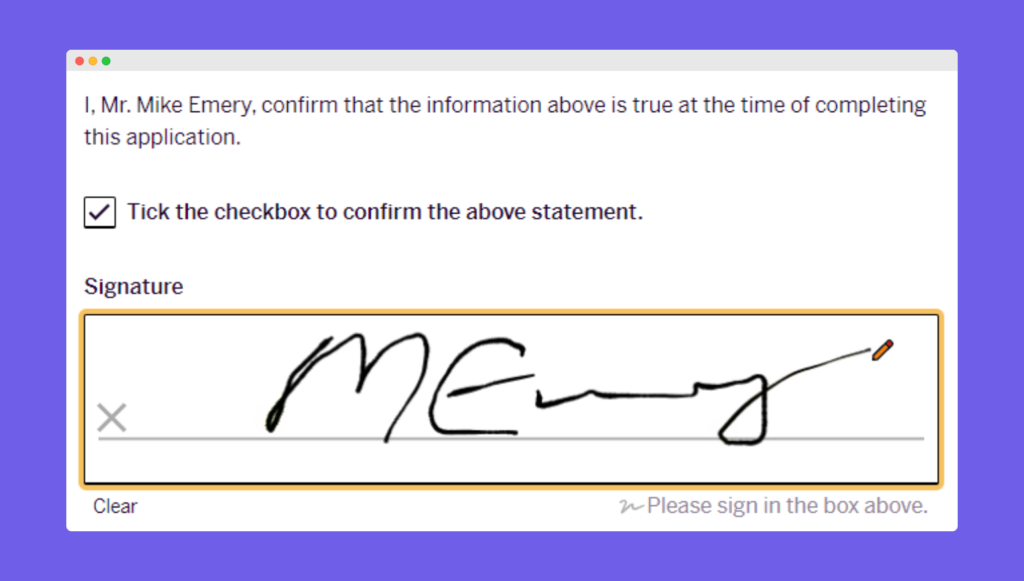
Following on nicely from using static text to display important statements, if you require a signature from your lead, they can do it there and then with an electronic signature!
Say goodbye to asking leads to return forms in the post with a wet signature – this may not be convenient for them, they may forget, or maybe they simply can’t be bothered. So, make it easy for them – our signature field allows you to collect an immediate cursor signature from your leads directly within your form.
🎁 Bonus feature 🎁
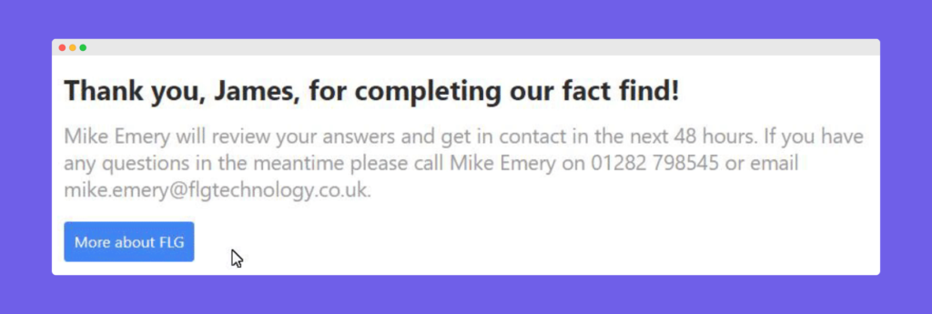
Once your form has been completed, why not show a custom thank-you page and a redirect button to explain what happens next.
This handy new feature allows you to include text using your own industry language alongside data from your lead to personalise your thank you message.
Adding a redirect button lets you send your lead to any http or https page, which you could use as an up-sell opportunity or to send them to a page that provides more information or outlines the next steps in your process.
Discover our unique CRM features in action
Check out our case study, outlining how our customer Professional Leads has made great use of some of these features in order to collect online Letters of Authority from individuals searching for financial advice and pass them on to clients purchasing their financial services leads.
Want to learn more about Journeys?
Our friendly team would be happy to show you around.
Get a free demo